LADYBUG LOGO

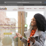
Ladybug Solutions ia a health and wellness company that wated to refresh thier brand for a more clean and professional look. Sometimes I am asked to refresh a company’s logo .My approach to the design came with the 3 things in mind

1. How long has the company been around.

2. How strong is there current brand

3. Does the logo need to be totally revamped

The reason for all of this is to see if i can improve on the logo or do i need to revamp the logo. In this case i didn’t feel I needed to give them a new logo all together i felt like the original was off to a good start and that i could just add more color and a stronger font.

RECENT WORK

RESOURCES

content is king
RESOURCES

Content is King

CONTENT IS KING ! Our presence on the web is super important from the way our site looks to the eser experience it all plays a big part of whether you get traffic and more importantly repeat traffic.

Read More »
welcome to the dark web
RESOURCES

Welcome to The Dark Web

I have been in the graphic design business for over 10 years held various positions at companies from webmaster to content creator for companies ranging

Read More »
RESOURCES

Begin Anywhere

I grew up in a big family in Brooklyn NY back in the 70’s maybe that’s what I was running from. Anyway as I got

Read More »
RESOURCES

DO YOUR HOMEWORK

Whenever I start a project I always try to get as much information from a client  about their likes dislikes needs and expectations of the

Read More »
RESOURCES

Trust your wings

One of the things that i had to learn quickly when I started this business was that you only ask for what you think you

Read More »

See All Resources